


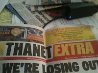
The top three pictures are of existing mastheads and the bottom image of the masthead that I made for my newspaper.
My masthead has followed the codes and conventions of the local papers through being bold, large and eye catching. I looked at various mastheads to look at the main factors that they use, as well as speaking to my focus group about the type of masthead that they like and find attracting.
My focus group said that they prefer plain and simple mastheads, yet still eye-catching. Examples that they gave were the 'Thanet Gazette' as it's simple, but still eye-catching due to the bold writing and the way that 'Gazette' is written in a different colour, drawing attention to it. My focus group also gave me examples of national papers, for example, 'The guardian'. So i took ideas from both of these examples to make something new.
From the gazette I took the way in which the masthead is on two lines, so I've taken this aspect of the masthead, by placing 'Thanet' and 'Messenger' on different lines. I've done this as it then allows me to have space for the symbol as well as it making my writing larger, so catches the audiences eye easier. Then from 'The Guardian' I took the style of writing that they use as I saw it to be a smart and formal font, compared to others that I've seen. I also took the comments that my focus group made about it needing to be larger, therefore, I also took inspiration from 'Thanet Times' by writing my masthead in capital. You can clearly see all of these aspects working together in my masthead above.
No comments:
Post a Comment